You don't just see colour — you feel it. The palette of your home operates beneath conscious awareness, influencing your mood when you wake up, your energy levels through the day, and how settled you feel in the evenings. Getting the colour choices right is not about fashion or trends. It's about designing a home that actively supports the way you want to live.
Warm Neutrals — Trust and Comfort
Cream, beige, warm grey, and off-white create a baseline sense of safety and openness. These are the colours that make a room feel like it's holding you rather than demanding anything from you. In Indian homes, warm neutrals have always been the instinctive base palette — they resonate with natural materials like stone, jute, and wood that have defined domestic spaces for generations.
For Bangalore apartments specifically, warm neutrals are the most versatile choice. They work under both the brilliant natural light of mornings and the warm artificial light of evenings. They don't clash with any furniture style. And they don't date — a room painted in warm cream in 2019 looks as considered today as it did then.
The critical detail is undertone. "Warm white" is not the same as "bright white." A white wall with a cool (blue or green) undertone creates a clinical, slightly anxious feeling that no amount of warm furniture can fully counteract. Choose whites and beiges with yellow or pink undertones — these are the ones that make a room breathe.
Blue — Focus and Calm
Blue is cognitively interesting. Light, desaturated blue promotes sleep — there's physiological research behind this, not just design intuition. It slows breathing slightly and reduces cortisol. This makes it excellent in master bedrooms for people who struggle with sleep or carry stress from work into home hours.
Navy and dark indigo as accent tones add depth and sophistication. A navy accent wall in a study or home office creates the right psychological environment for focused work — contained, serious, but not oppressive. Avoid blue in kitchens: colour psychology research consistently shows that blue suppresses appetite, which is a disadvantage in a cooking environment designed to connect you to food.
In children's rooms, pale sky blue creates a calming environment but lacks the stimulation that growing minds need. Pair it with warm yellow or coral accents to introduce energy without chaos.
Green — Balance and Nature
Of all the colours used in interior design, green has the most consistent positive associations. It connects interior spaces to the natural world — to trees, gardens, and the landscape that humans evolved within. Sage green, olive, and forest green all carry this quality, with different levels of visual weight.
Sage green is currently one of the most requested accent colours in our Bangalore projects — particularly for kitchen shutters and feature walls in master bedrooms. Its muted, slightly greyed tone works with warm neutrals without competing, and it photographs exceptionally well in natural light.
Green in bathrooms creates a spa-like quality. Green in living rooms as an accent wall or in soft furnishings adds depth without the heaviness of dark tones. The key is choosing warm-undertone greens (olive, sage, moss) rather than cool-undertone greens (mint, lime) for Indian homes — the warm undertones integrate better with the warm light conditions and material palette of most Bangalore apartments.
Sage green kitchen shutters — one of the most requested colour choices across our current Bangalore projects.
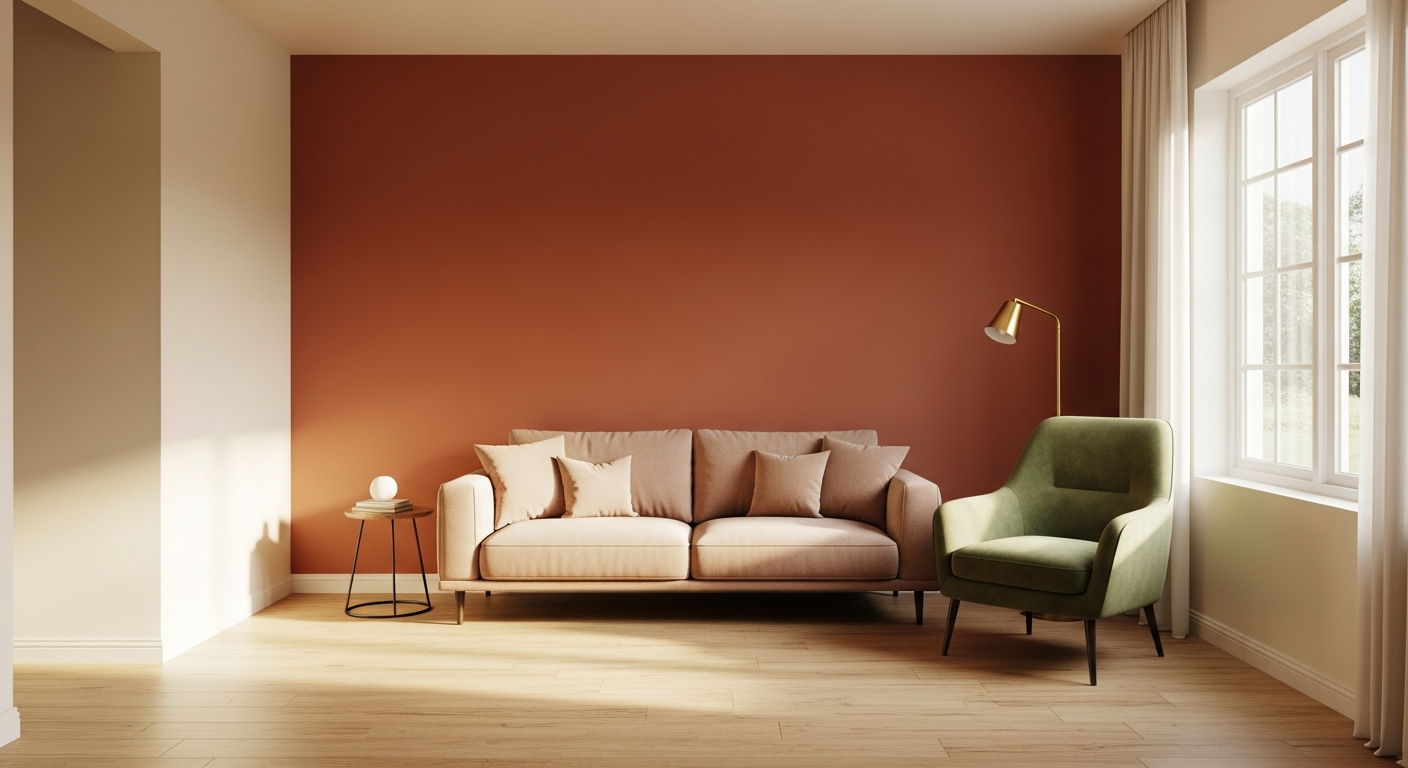
Terracotta and Warm Earth Tones — Energy and Groundedness
Terracotta, clay, and burnt sienna carry warmth without the anxiety of brighter oranges and reds. In Indian homes, these tones have deep cultural resonance — the colour of clay pots, of temple walls, of the earth itself. Used as accent colours in living rooms or as full-wall treatments in dining areas, they bring grounded energy: the feeling of being rooted and present.
As an accent wall colour, terracotta works beautifully behind a dining table where it creates warmth during meals. In a pooja room, terracotta or deep ochre has both psychological and cultural appropriateness. Avoid using it in bedrooms as a dominant tone — its energising quality can interfere with restful sleep.
Warm earth tones also work as accents within a neutral base: cushions, throws, ceramic accessories, or a single piece of wall art in terracotta shades bring warmth without the commitment of a full wall.
Yellow and Gold — Optimism and Warmth
Full yellow walls carry a risk: at high saturation, yellow can feel overwhelming within hours, even if it seemed cheerful in a paint chip. Muted mustard and warm ochre, however, add quiet optimism without the assault of bright yellow. A mustard accent cushion or a warm gold handle on a wardrobe adds a note of cheerfulness that reads as confident rather than loud.
Gold hardware — handles, taps, light fittings — is the most accessible way to introduce this quality throughout a home. Matte or brushed gold reads warmer and more sophisticated than polished gold, which can feel overstated. In the context of a warm neutral palette, gold hardware acts as punctuation — small, consistent, and tonally harmonious.
Dark Tones — Drama and Intimacy
Charcoal, deep walnut, and espresso brown used as accent tones create a sense of enclosure and intimacy. In large living rooms where the space feels cavernous, a dark accent wall behind the sofa creates a zone — the space feels more human-scaled. In a bar area or home theatre, dark tones create the right psychological cues for evening relaxation.
The discipline with dark tones is proportion: use them on one surface, not all four walls of a small room. A 10x10ft room with four dark grey walls creates a cave. The same room with one charcoal accent wall and three warm cream walls feels anchored and interesting.
How We Approach Colour at Nexus Living Hub
We design colour palettes room by room, with the full-home palette in mind. The living room receives a neutral foundation that can support either formal or casual furniture arrangements. Each bedroom gets a personalised palette based on who uses it — a couple's master bedroom gets one treatment, a child's room gets another, a teenager's room another. The kitchen's palette connects to the living room if it's open-plan, or gets its own independent treatment if closed.
Colour decisions and material decisions are made together — the laminate finish on the kitchen, the wardrobe surface, and the wall paint must be resolved as a single palette, not separately. For clients exploring villa interior design, we typically develop a multi-floor colour strategy where each level has its own character while sharing the home's underlying warmth. Our warm minimal design guide shows how palette restraint creates the most enduringly beautiful interiors.
Need Help Choosing the Right Palette for Your Home?
Our designers will work through your colour palette as part of the full design process. Book a free consultation to get started.
Frequently Asked Questions
Warm neutrals as the base — cream, warm beige, or soft warm grey for walls — with 1–2 accent colours per room. This palette works with every furniture style, photographs beautifully, and never dates. It's also the easiest palette to update over time: change the soft furnishings and the room feels new without repainting.
No — but they should feel cohesive. A shared undertone ties different room palettes together. If your living room uses warm-toned neutrals, your bedroom and kitchen should also use warm-undertone colours even if the specific shades are different. Mixing warm and cool undertones across rooms creates visual dissonance when you move between spaces.
Yes, significantly. Light warm neutrals on walls, ceiling, and large surfaces expand visual space by reducing contrast. Dark accents on a single wall create perceived depth — the room appears to recede rather than close in. Avoid very dark colours on all four walls of a small room — this creates a cave effect regardless of lighting quality.